For my test shots I wanted to use a product inside the cups, but the only access to a product, would mean I had to purchase one. I therefore decided that for the purpose of my test shots, said product could stay put in the cups I bought them in. They also doubled up as research pieces, and meant my cups wouldn't get messy from the purchased beverage.
Include Product.
For my images, I want to use a product like the one I used in my test shots, as I liked both the texture of the froth, and the way it contrasted with the white inside of the cup. I also think this fits the brief in the aspect of showing how their products can be used. I considered using a square formatted image, but the brief isn't completely clear as to whether this would be an acceptable format. I therefore am going to stick to standard formatting. I really like the image below and is one of the ones I'd like to re-create. However, I do not think it would be as effective in a standard format. I could use the concept but would have to recompose the shot with different angles.
For my images, I want to use a product like the one I used in my test shots, as I liked both the texture of the froth, and the way it contrasted with the white inside of the cup. I also think this fits the brief in the aspect of showing how their products can be used. I considered using a square formatted image, but the brief isn't completely clear as to whether this would be an acceptable format. I therefore am going to stick to standard formatting. I really like the image below and is one of the ones I'd like to re-create. However, I do not think it would be as effective in a standard format. I could use the concept but would have to recompose the shot with different angles.
Including Some Background Information.
I tried to produce an example that included some background information, but I aimed to avoid a busy backdrop as the important part of the image is the actual product. I used an aperture of 1.8 to get the blurred effect. I think this helps keep the focus on the subject. I like the effect it gives with the shallow depth of field.
I tried to produce an example that included some background information, but I aimed to avoid a busy backdrop as the important part of the image is the actual product. I used an aperture of 1.8 to get the blurred effect. I think this helps keep the focus on the subject. I like the effect it gives with the shallow depth of field.
Alternative Square Format Example.
I produced a second image from the previous photograph before I decided against using anything other than a standard sizing. This shows the difference between having more or less background 'information'. I like the colours more in this second image as I think they compliment each other better. I think I may go back to Costa to do my shoot instead of using the studio. If I have time I will also take photographs in the studio in addition to the ones in Costa.
Images Including Accessories.
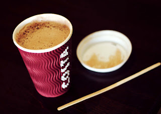
I like these images because of the dark background. It gives a good contrast to the product and makes it more dynamic. It reminds me of the images by Edward Weston where his images also showed a dark backdrop. I like the second shot the best out of theses two, but the content may look better visually if it was lightened slightly. I like the texture of the corrugated cups, as I think it adds to the overall look visually. I think I will try to reproduce
Uniformed, Documentary Style
This image, again reminds me of Edward Weston's work because it had a uniformed, documentary feel to it. It has a similar use of space around the edge and has a dark background like the images he created. I feel this is one of my strongest test shots and I would like to re-create it in my shoot. Again, I like the texture and contrast of the cup, this is due to the lighting and actual shape of the product.
This image, again reminds me of Edward Weston's work because it had a uniformed, documentary feel to it. It has a similar use of space around the edge and has a dark background like the images he created. I feel this is one of my strongest test shots and I would like to re-create it in my shoot. Again, I like the texture and contrast of the cup, this is due to the lighting and actual shape of the product.
Conclusion.
Overall I think I created some good images in during my test shoot, and I would like to try and recreate a few of them as well as trying out some new ideas talked about in my initial mind map. The main new concept I would like to try is movement.


No comments:
Post a Comment